ggplot2覚書③ 注釈(解釈補助)
引き続き「Rグラフィッククックブック」。

Rグラフィックスクックブック ―ggplot2によるグラフ作成のレシピ集
- 作者:Winston Chang
- 発売日: 2013/11/30
- メディア: 大型本
過去記事は以下
注釈をつける
annotate関数を用いると、グラフ内であらゆる幾何オブジェクトを重ねることができる。
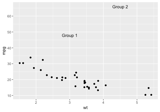
テキスト
オプションgeom = "text"とすると任意の位置にlabelで記述したテキストを指定できる。
p <- ggplot(faithful, aes(x=eruptions, y=waiting)) +
  geom_point()
p + annotate("text", x=3, y=48, label="Group 1") +
  annotate("text", x=4.5, y=66, label="Group 2")
なお、geom_textでも同様の処理はできるが、こちらはデータに基づいて複数回上書きが発生するため書籍ではannotateの使用が推奨されている。
網掛け
rectを指定することで任意の範囲に網掛けをおこなえる。
library(gcookbook) #データセットの読み込み

ggplot(subset(climate, Source=="Berkeley"), aes(x=Year, y=Anomaly10y)) +
  geom_line() +
  annotate("rect", xmin=1950, xmax=1980, ymin=-1, ymax=1, alpha=.1, fill="blue")
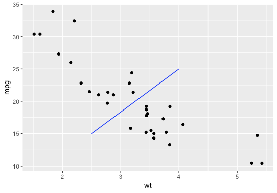
線
"segment"とx, yの始点終点を指定する。
ggplot(mtcars, aes(x = wt, y = mpg)) +
  geom_point() +
  annotate("segment", x = 2.5, xend = 4, y = 15, yend = 25,
             colour = "blue")
annotateを使わない方法としては、geom_hline関数で水平線、geom_vline関数で垂直線、geom_abline関数で傾き線を追加できる。
こちらはaesの指定で値のmappingができたり、直線の指定が直感的なのでこちらの方が使いやすい。
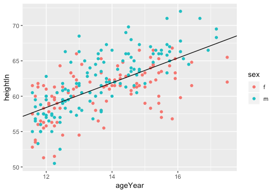
library(gcookbook) # データセットの読み込み

p <- ggplot(heightweight, aes(x=ageYear, y=heightIn, colour=sex)) +
  geom_point()

# 水平線と垂直線を追加する
p +
  geom_hline(yintercept=60) +
  geom_vline(xintercept=14)

# 傾きのある直線を追加する
p +
  geom_abline(intercept=37.4, slope=1.75)
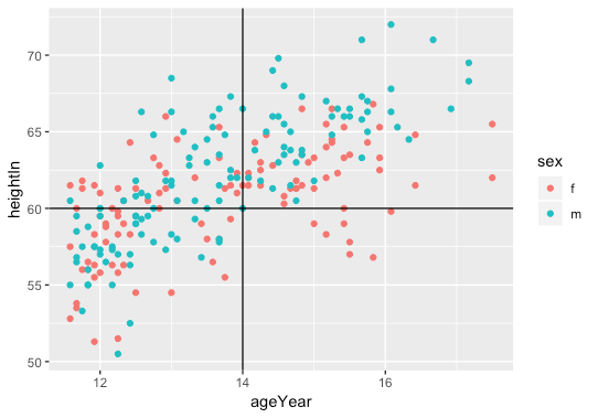
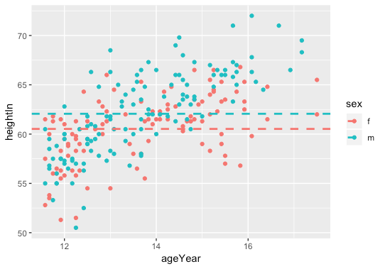
aesを用いて、xintercept, yinterceptにデータに基づいて値のマッピング。
library(plyr) # ddply()関数の読み込み

hw_means <- ddply(heightweight, "sex", summarise, heightIn=mean(heightIn))
# => sex heightIn
# 1   f 60.52613
# 2   m 62.06000

p + geom_hline(aes(yintercept=heightIn, colour=sex), data=hw_means, linetype="dashed", size=1)
要素の強調
強調したいものに色をつけて、他は灰色に指定する。
library(dplyr)

PlantGrowth %>%
  mutate(hl = if_else(group == "trt2", 'yes', 'no')) %>% # 強調したいものをyesにする
  ggplot(aes(x=group, y=weight, fill=hl)) + # 判定列でfill
  geom_boxplot() +
  scale_fill_manual(values=c("grey85", "#FFDDCC"), guide=FALSE) # 強調以外を灰色
一般的な方法は上記だが、gghighlightという強調用のパッケージがありそっちを使ったほうが楽(そのうち記事書く予定)。
GitHub - yutannihilation/gghighlight: Highlight points and lines in ggplot2
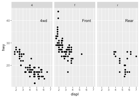
各ファセットにテキストを追加
各ファセットに対応するデータフレームオブジェクトを作成し、geom_textに渡すことでおこなえる。
p <- ggplot(mpg, aes(x=displ, y=hwy)) +
  geom_point() +
  facet_grid(. ~ drv)

# 各ファセットに対するラベルを含むデータフレーム
f_labels <- data.frame(drv = c("4", "f", "r"), label = c("4wd", "Front", "Rear"))

p +
  geom_text(x=6, y=40, aes(label=label), data=f_labels)

# annotate()関数を用いると、ラベルはすべてのファセットに表示される
# p + annotate("text", x=6, y=42, label="label text")